Canberra Weather - The Last Year(s)
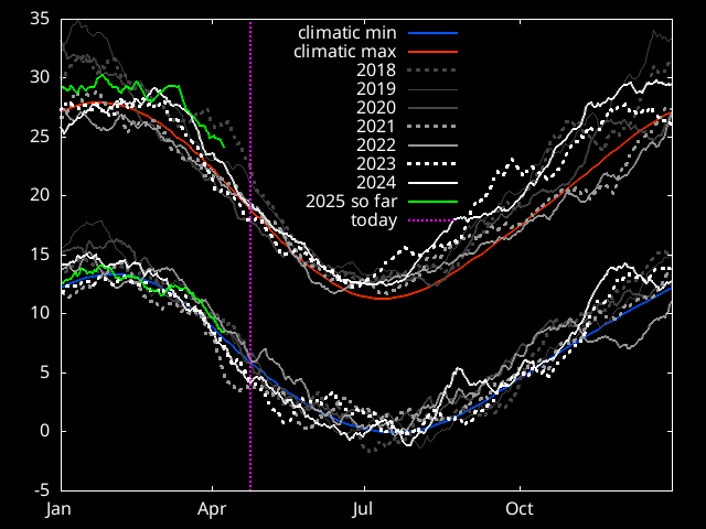
30 day means are calculated using daily min/max data from BoM.
The green line shows the year so far. It lags by 15
days from todays date because of the 30 day averaging.
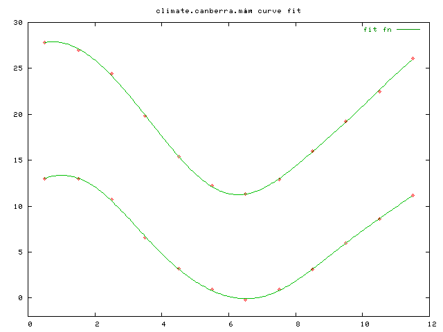
Dashed red/blue lines are a curve fit to the Climate since 1939.
Note that I wasn't saving min/max data prior to May 2009. The daily
minimum and maximums before May 2009 are instead computed
from hourly temperatures which are under-sampled compared to the BoM
data and the real
temperatures - so the wiggly maximum curves should be
about 1C higher in summer months and 0.5C higher in winter months, and
the wiggly minimum curves should be about 0.5C lower.
![]()
![]()
![]()
![]()
![]()
![]()
![]()